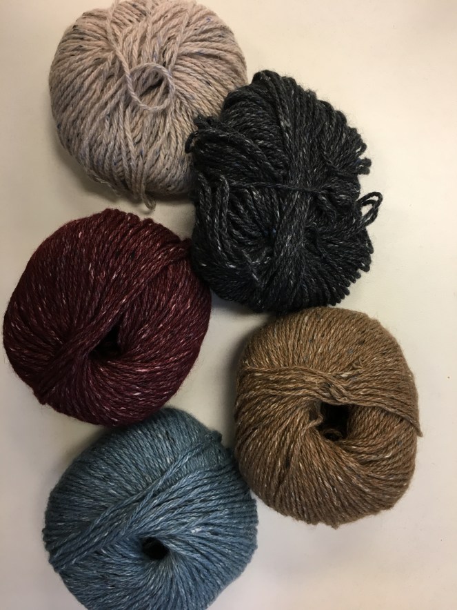
We’re celebrating colorwork knitting this week at Berroco! Yesterday’s KnitBits had tips on how to get started, including a handy video to show you how to twist your stitches along each row or round, and today I’m going to be talking about how to choose colors for stranded colorwork. This week’s free pattern, the Fox Grape mittens, uses Berroco Tuscan Tweed™, so I’m using most shades of Tuscan Tweed.
There’s a lot of discussion out there around how to choose the best colors for colorwork knitting, and they’re worth seeking out. You can get really in-depth on the subject, involving color wheels and color theory and a lot of really fascinating discussion… but that doesn’t necessarily help you get started knitting colorwork. I highly recommend diving into that subject if it appeals to you, but this blog is going to be the quick-and-easy, “here’s how I choose colors for colorwork projects without making myself insane” version.
It all centers around color values, or how dark or light the colors appear when they’re stripped of their hues. In color theory, “value” refers to how deep or light a color is; “hue” is the color itself. When choosing colors for stranded knitting, you want a balance of values. You can also think about this in terms of contrast colors. And in today’s modern age where pretty much all of us have cell phones that can take photos, it’s incredibly easy to determine color values. To keep things simple to start with, I paired shades of Tuscan Tweed together in photos. The blues and the dark gray/black shades obviously don’t contrast much—while they are each different colors, they have similar values, or darknesses, so they wouldn’t be ideal when paired together in colorwork.
The bottom two shades though are a little less clear. To our eyes, there’s a distinct difference between Grape and Cherries, and also between Iris and Sweet Briar. Let’s look at these pairings again in black and white—most phones allow you to easily change to a black and white or monochrome setting in the camera.
Here you can see that our blues and a blacks are still too close in value to provide good contrast. But look at Cherries and Grape, and Iris and Sweet Briar—they’re also practically the same. They have too little contrast, or too similar values.
I took the Iris and Sweet Briar pairing and threw in Cherries to see what would happen. You can see in the photo on the left that they all are in the same family (Iris is more neutral gray than pink but it works), but in the photo on the right, the addition of Cherries breaks up similar values enough to balance it out. Swapping out Sweet Briar and and adding in Cornflower is even better—you can see Cornflower is a middle value, Cherries is a dark value, and Iris is a light value.
Just for fun, I played around with five colors of Tuscan Tweed: Iris, Nightshade, Cherries, Oak, and Cornflower. If I was going to do a more involved colorwork project, I’d probably look at using shades like these in combination.


If you go to your LYS, let the shopkeeper know that you’re playing with colors, and whip out your phone to check the color values when planning your colorwork project!


Very helpful..thank you. Hope to learn more about color!